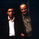
Aleksandr Lakhonin Posted October 26, 2011 Share Posted October 26, 2011 (edited) Edited October 26, 2011 by T omyy 1 Link to comment Share on other sites More sharing options...
u q p u Posted October 26, 2011 Share Posted October 26, 2011 Mda... destul de urât. N-are niciun aspect și nu-mi pot da seama cum poza aia, sau ce o fi, poate fi considerată o semnătură. Link to comment Share on other sites More sharing options...
Trip. Posted October 26, 2011 Share Posted October 26, 2011 (edited) Textul nu e prea bine integrat in poza, incearca sa cauti o alta textura si sa o pui peste text cu ceva opacity mai mic apoi era frumos daca avea o forma(shape) de triunghi cu colturile taiate, asa e prea patratoasa dar oricum esti incepator, mai ai multe de invatat. Alc0, crede-ma, nu s-a nascut nimeni invatat, deaia trebuie sa ii explici nu sa il iei cu critica, trebuia sa ii zici ce a facut ce nu a facut bine si ce trebuia sa mai faca, e un efort si un timp pierdut pe care tu nu ti l-ai fi asumat. Edited October 26, 2011 by Ceaoz Link to comment Share on other sites More sharing options...
Atyss Chaos Posted October 27, 2011 Share Posted October 27, 2011 Nu este asa reusit , fundalul acela strica totul , este foarte simplu . Ai pus un text pe un wallpaper , este foarte usor sa faci acest lucru ; incearca sa urmezi tutoriale pentru inceput , foloseste mai multa creativitate. Link to comment Share on other sites More sharing options...
Aleksandr Lakhonin Posted October 27, 2011 Author Share Posted October 27, 2011 Ok, va multumesc pentru sfaturi. Link to comment Share on other sites More sharing options...
NB2 NighTuleTz Posted November 12, 2011 Share Posted November 12, 2011 Frumos Logo-u , bv Link to comment Share on other sites More sharing options...
Recommended Posts